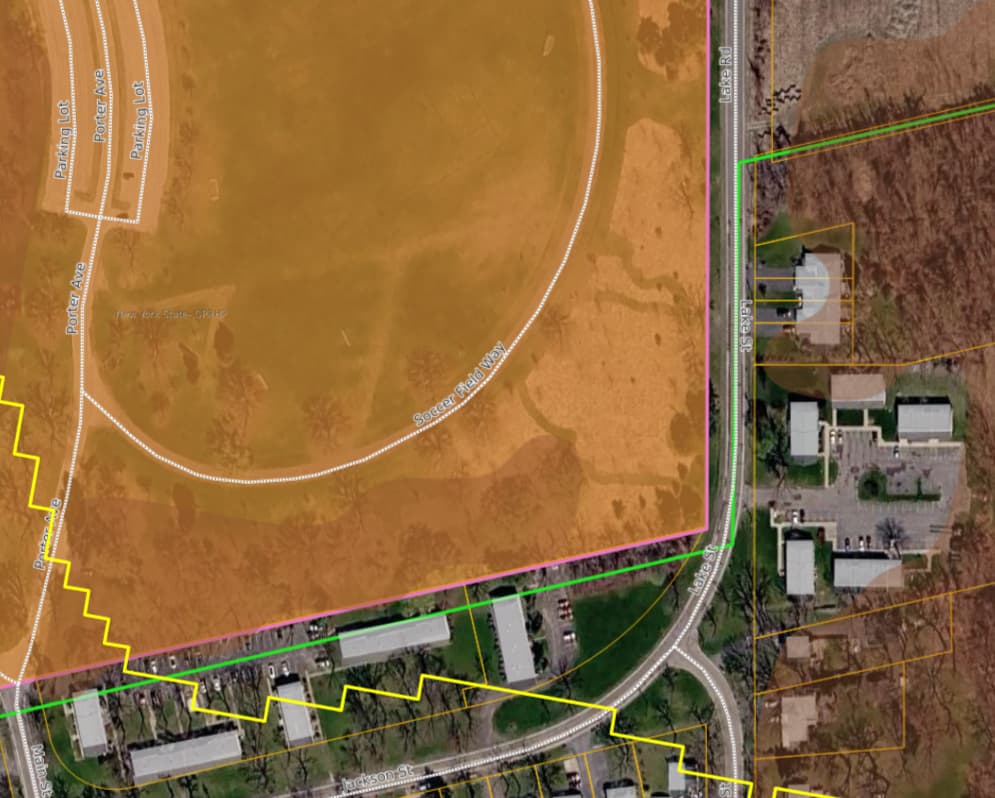
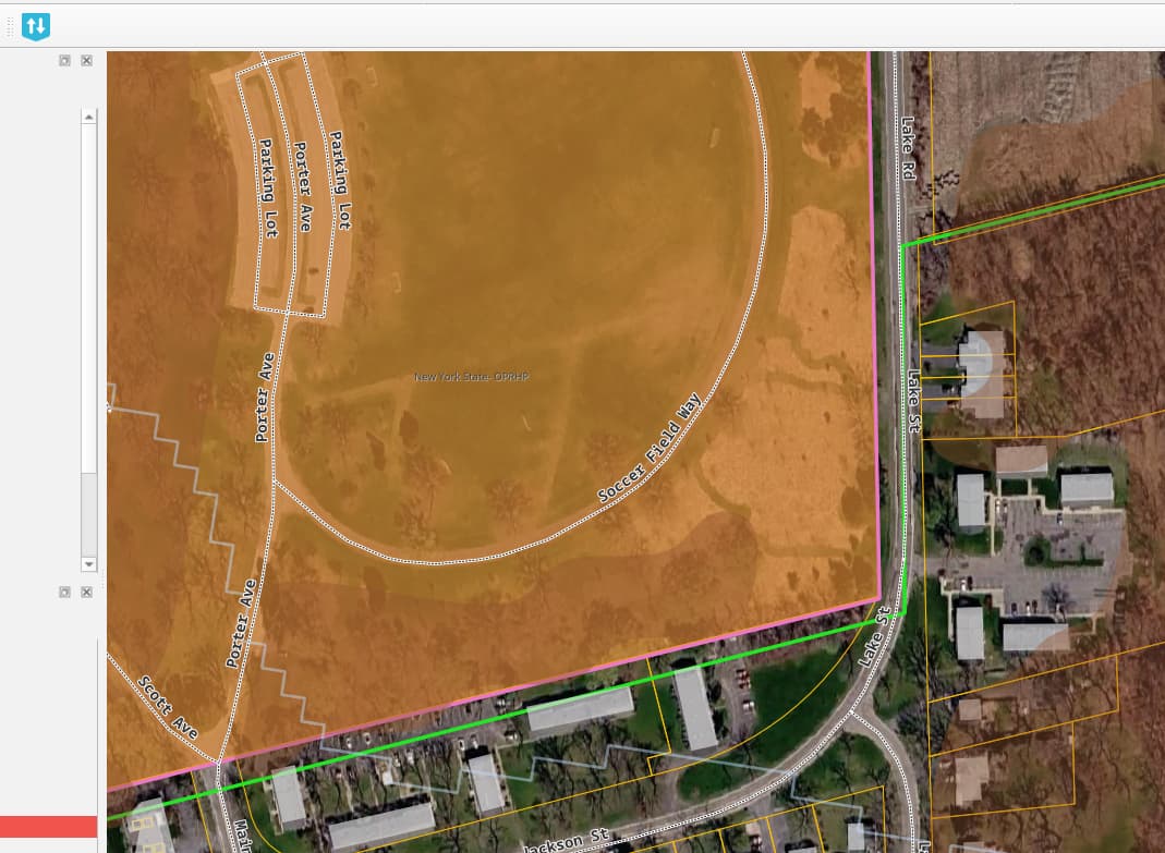
Looks like my text didn’t go along with the pictures and I can’t figure out how to edit my post. This is what I wanted to say, “I just deployed NextGIS Web community edition to docker (IMAGE_VERSION=26.04.0) and have pushed a QGIS project using Connect from QGIS. My only issue so far is that the text for labels is very fuzzy, like it’s too compressed. Is there a way to adjust this? See attached. I tried making the font bigger so that it’s readable, but I’d rather have sharper text.”
Hello John!
This behavior is worth exploring. My first thought is that the label may be rendered underneath the polygon fill from another layer.
NextGIS Web renders layers one by one, including their labels, unlike QGIS, which places all labels on top of the map after rendering the layers.
But it could also be something else. If you can provide the layer and its style, that would be very helpful for investigation.
Hi Eduard,
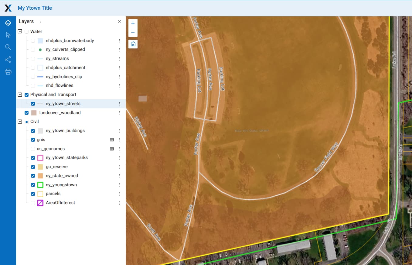
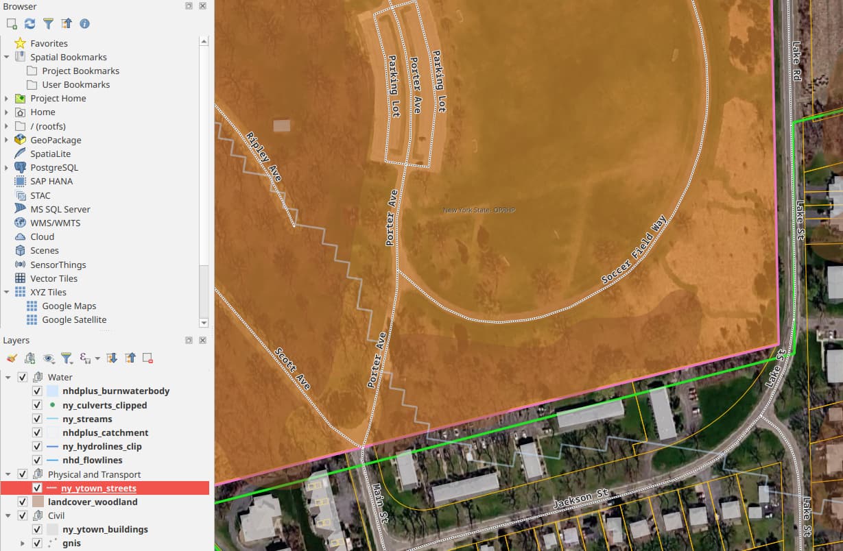
Thanks for the reply. The layer features do not overlap the labels or features (see images). The example data and project are from this repo GitHub - johnzastrow/marimo-qgis: Marimo notebooks with QGIS4 (PyQGIS) on Linux · GitHub in the example directory. I stuck some supporting files in there.
1 Like
Thanks for sharing. I can see some label rendering issues in your example as well.
Could you also try opening this web map in different browsers? It seems that some browsers handle the rendering better than others.
It could also be related to the font being used. If a font configured in QGIS is not available in NextGIS Web, the system falls back to a default font. Please make sure that the selected font is installed in NextGIS Web (Control Panel → Font Management).
Sorry for the delay in replying. Yes, sending the same font to the server helped quite a bit. However checking the output (I’ll have to post later) across several browsers (both chromium and firefox based) did not show any noticeable differences.
The output from vectors is entirely rendered raster tiled, correct? There are no vector tiles at play, right?  I generally would say the output is just a touch too lossy compressed as everything seems just a little too soft and fuzzy. But making sure the fonts were present in both places helped.